
Kelmscott press book design
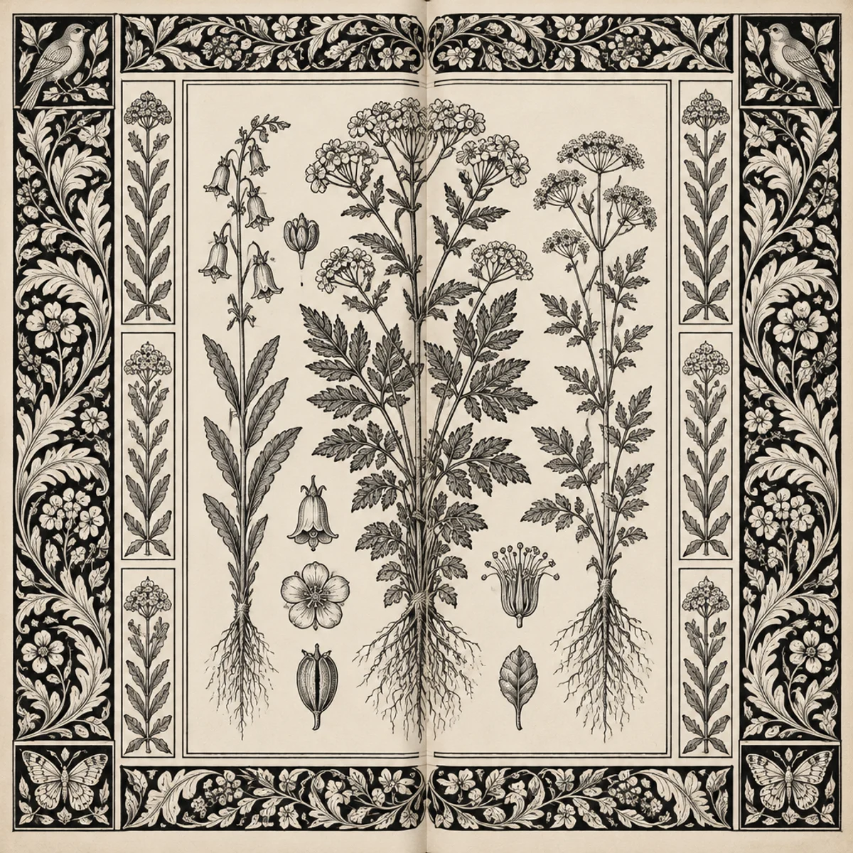
Botanical atlas spread
Kelmscott press design adapted to an atlas-style foldout with centered plate field, mirrored foliate borders, and dense marginal notes in archaic type.
Make
Kelmscott press book design treatment with dense botanical borders, weighty historic letterforms, and integrated page ornament.
This keeps the recognizable Kelmscott vocabulary—dense botanical ornament, heavy historic lettering, integrated page decoration—but changes the composition into an atlas foldout. The visible difference is the strong central image window and symmetrical side-margins, making the spread feel cartographic and archival rather than a conventional text page.
A starting point: add your own subject or details in your image tool.
Another original example of the same style seed.
Automated review only; results vary by image tool.
About this aesthetic and its examples
Compare more directions
Explore other approaches for this kind of project.



Look closer: traits and nearby styles →
About this example
This image may have used extra directions. The seed above is a reusable starting point and may produce a different result.
- Created with
- OpenAI Image API
- Model
- gpt-image-2.5-flare
- Generated
- 2026-10-18
How to use this promptRead as Markdown
Let ornament organize the page
Compare how a dense border relates to a page’s central field. Morris designed type, initials and ornament together; a border alone does not make a complete book design.
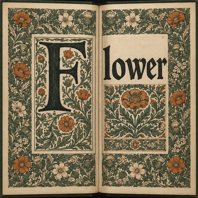
An enclosed book spread
Follow the botanical border around the spread, then compare the visual weight of ornament and central content.
Explore example →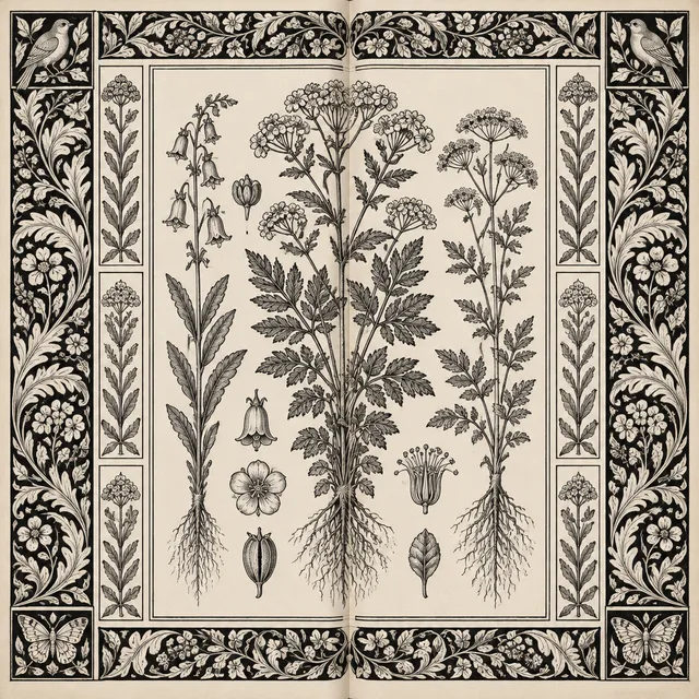
A central botanical plate
A larger central image field and mirrored side ornament create a different reading hierarchy within the same decorative direction.
Explore example →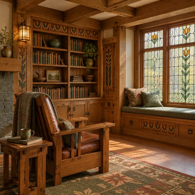
Compare ornament across a room
Arts and Crafts interiors connect botanical motifs with furniture and architecture, extending the relationship between detail and whole into a different medium.
Explore example →Try one change
Keep the page dimensions and central content fixed. Compare a narrower border, a larger initial and more open margin. For a readable publication, set and proofread real text separately; generated letterforms are visual inspiration.
Type and ornament share a page
William Morris designed typefaces, initials, borders and illustration frames for the Kelmscott Press. The V&A describes how these decisions worked together. Compare the weight of the central content with the surrounding botanical ornament, rather than treating decoration as a detachable frame.
The generated book spread encloses its central field in dense foliage. The plate variation gives more space to a central botanical image and organizes ornament into mirrored sides. Try a narrower border or a larger open margin while keeping the central content fixed.
These are AI page-design interpretations, not historical Kelmscott editions or print-ready layouts. Generated lettering is not reliable typesetting. Compose and proofread real text separately, and check margins, resolution and binding requirements for an actual book.
Learn more: V&A: William Morris, literature and book design
Look closer at Kelmscott press book design
Compare Kelmscott-inspired book spreads and botanical plate layouts: dense foliate borders, weighty lettering and integrated ornament, with reusable prompts.
In the original generated example: A fictional book spread with ornate botanical borders and historic-style lettering. Notice which details catch your eye before deciding whether the whole style is for you.
Ask yourself: is it the palette, the surface, the shapes, or the subject you like? Save a favorite and use the visual taste guide to find a useful next direction.