
Posters
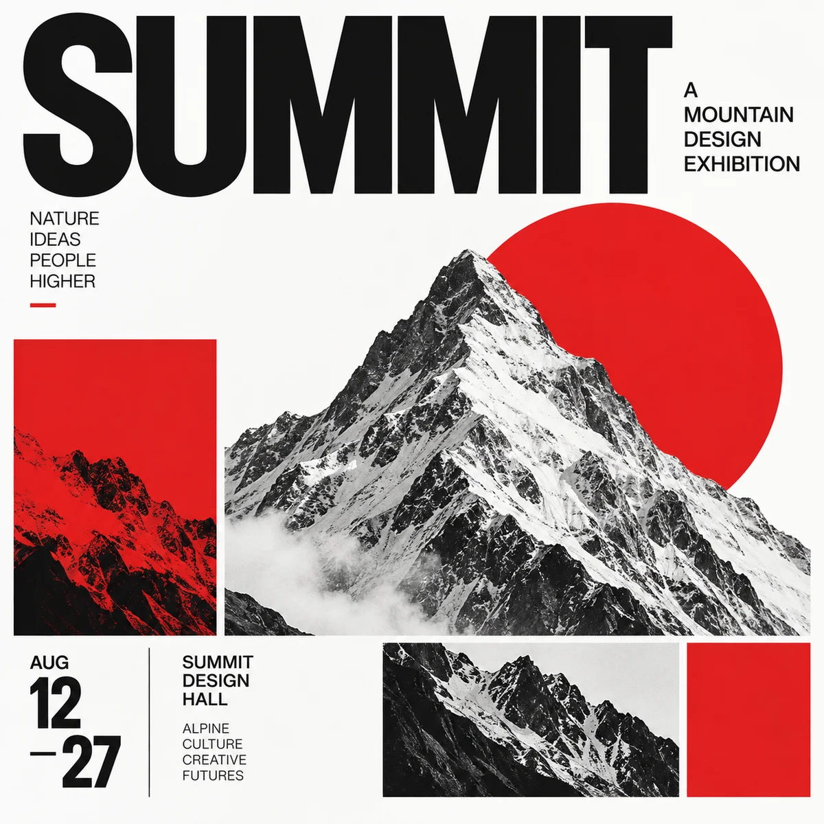
Swiss grid poster
Structured alignment and clear typographic hierarchy organize the poster.
Graphic & editorial design
Compare the way type, images and open space organize a page.
Explore Persian typography and calligraphy prompts
24 visual directions · Generated examples
Posters
Structured alignment and clear typographic hierarchy organize the poster.
Posters
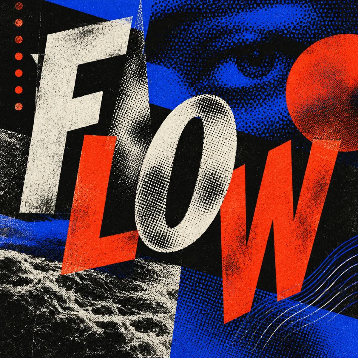
Shifted baselines and irregular spacing turn type into a spatial element.
Posters
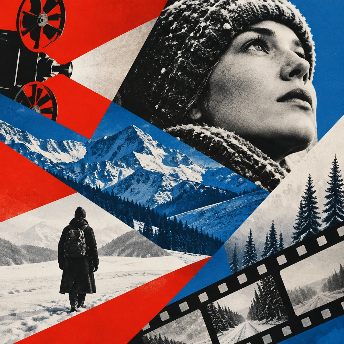
Diagonal structure and contrasting geometric fields direct attention.
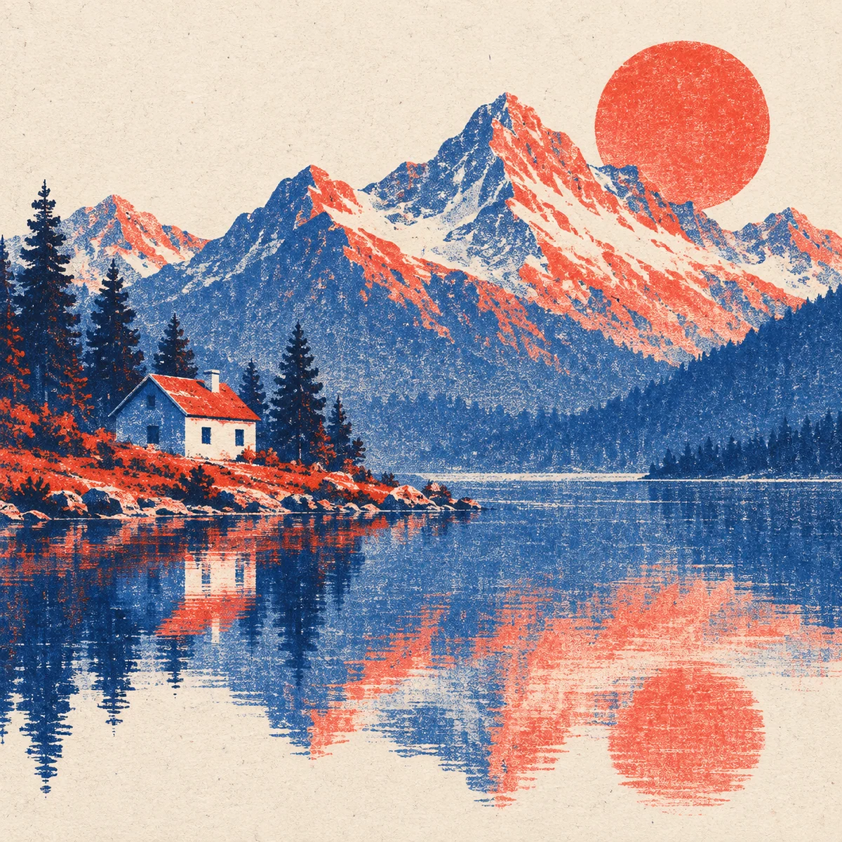
Technique references
Misregistered color layers and grainy ink suggest a tactile print treatment.
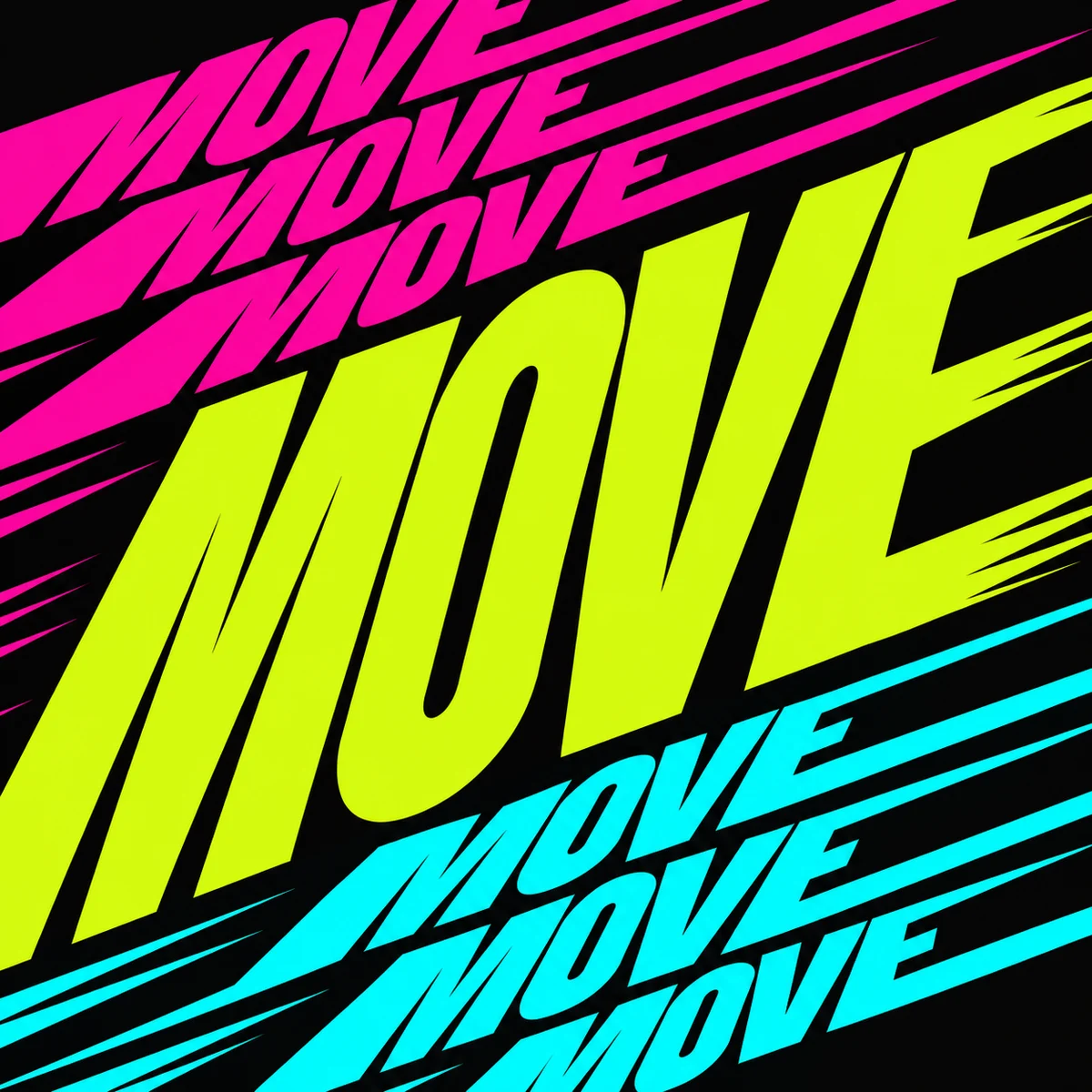
Posters
Stretched letterforms and repeated baselines suggest movement across a flat page.
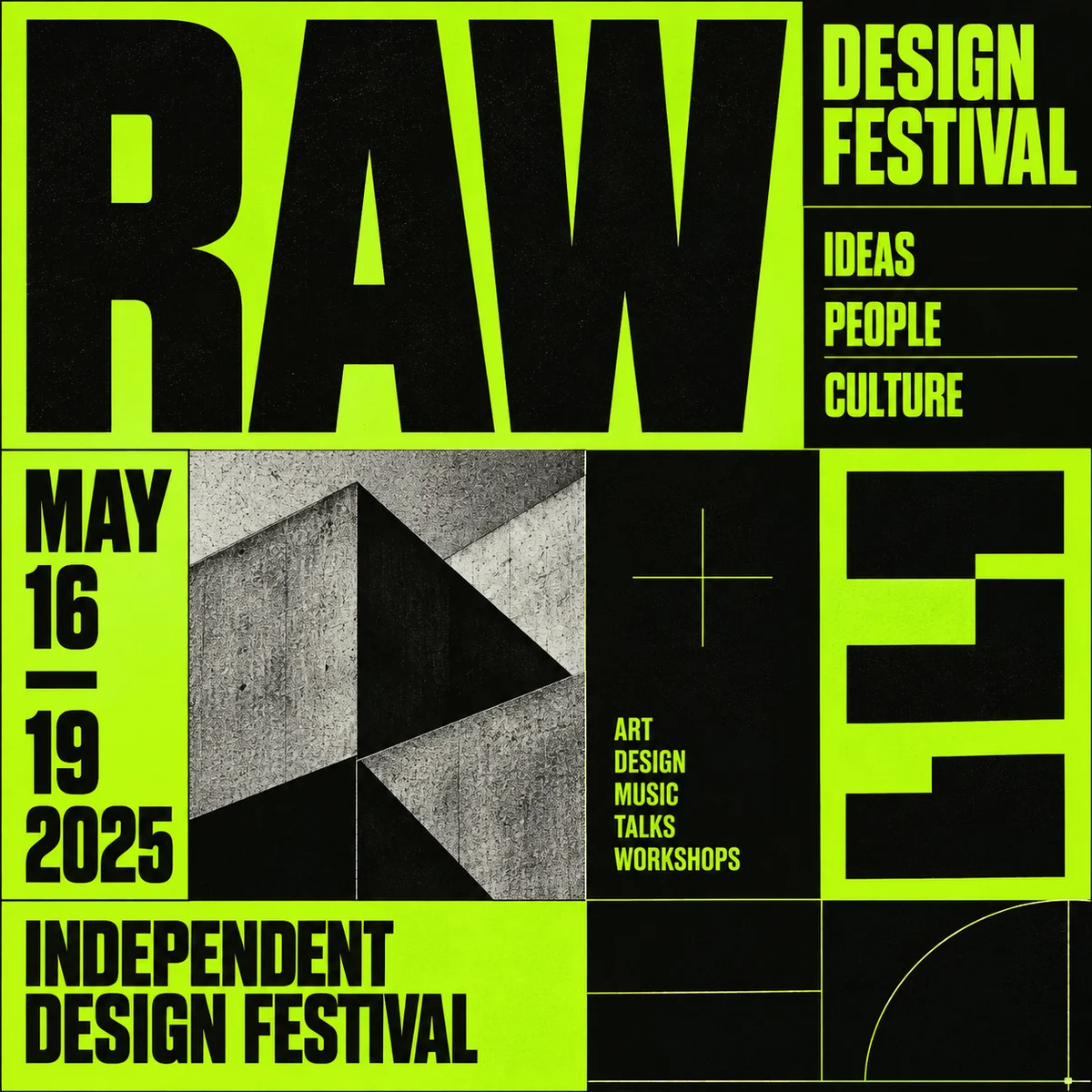
Posters
Raw type, blunt boxes, and abrupt scale shifts create a deliberately confrontational layout.

Typography
Confident brush-drawn letterforms, subtle paint texture, and a restrained decorative shadow with generous spacing define this traditional sign-painted lettering.
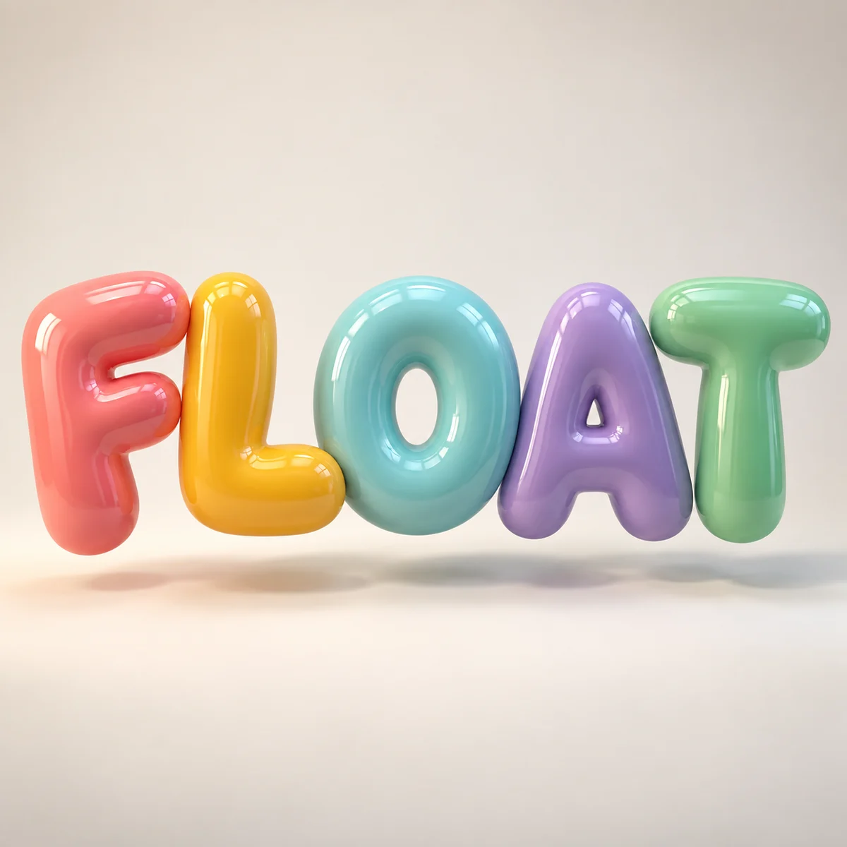
Typography
Inflated rounded letterforms, glossy colored surfaces, and soft realistic cast shadows on a simple backdrop define this dimensional typographic sculpture.
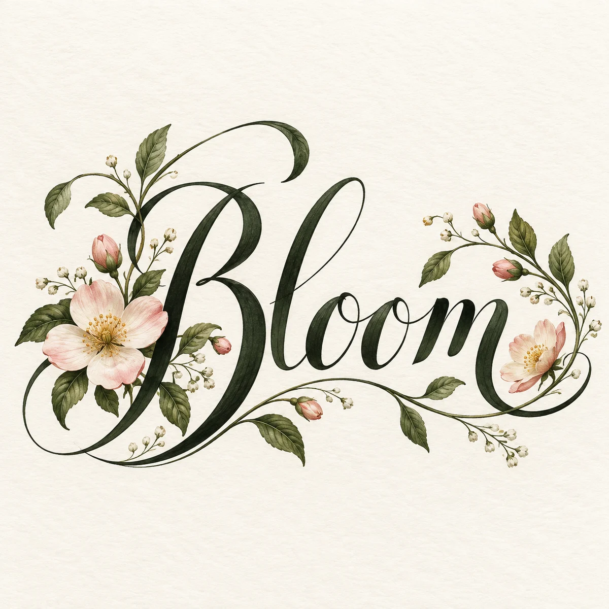
Typography
Contrasting thick and hairline strokes, elegant connected forms, and balanced botanical flourishes on ivory paper define this ornamental calligraphic lettering.
Typography
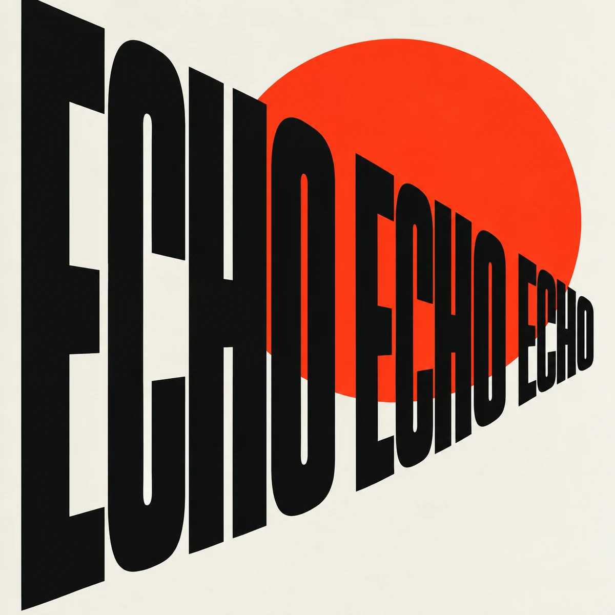
Stretched letter proportions, progressive spatial repetition, and high-contrast black forms with a single vivid accent define this experimental typographic composition.
Persian lettering
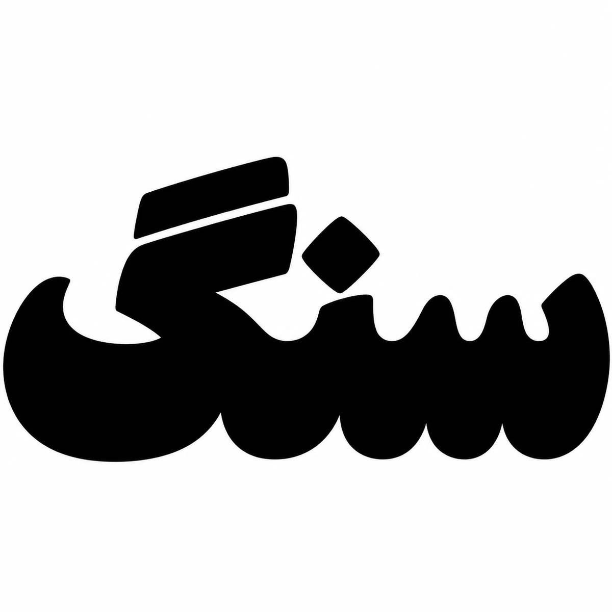
Sang means “stone” in Persian. Its weight comes from black curves packed shoulder to shoulder. Narrow cuts of white separate the teeth on the right, and a second bar identifies the final gaf.

Books & print ephemera
Bold illustrated scenery, lightly weathered printing texture, and prominent decorative destination lettering define this vintage travel postcard design.
Typography
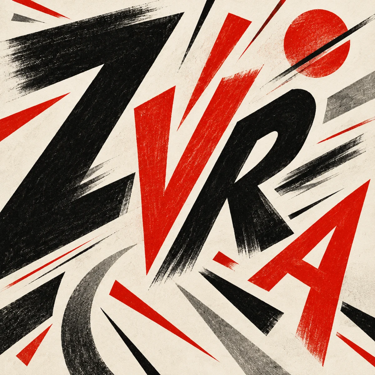
Explosive Futurist typography with scattered word sizes, diagonal and multidirectional reading, and letters treated as active visual marks.
Books & print ephemera
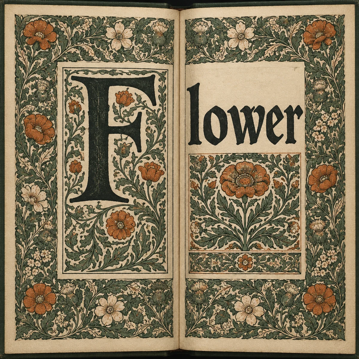
Compare Kelmscott-inspired book spreads and botanical plate layouts: dense foliate borders, weighty lettering and integrated ornament, with reusable prompts.
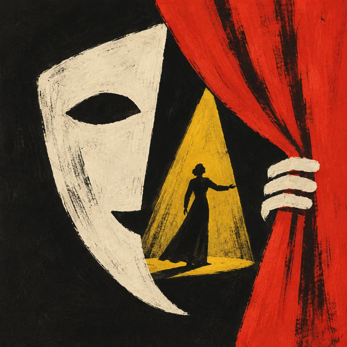
Posters
Poster art with metaphor-led central imagery, expressive hand-drawn marks, and painterly economy; symbolic, concise, and often surreal.
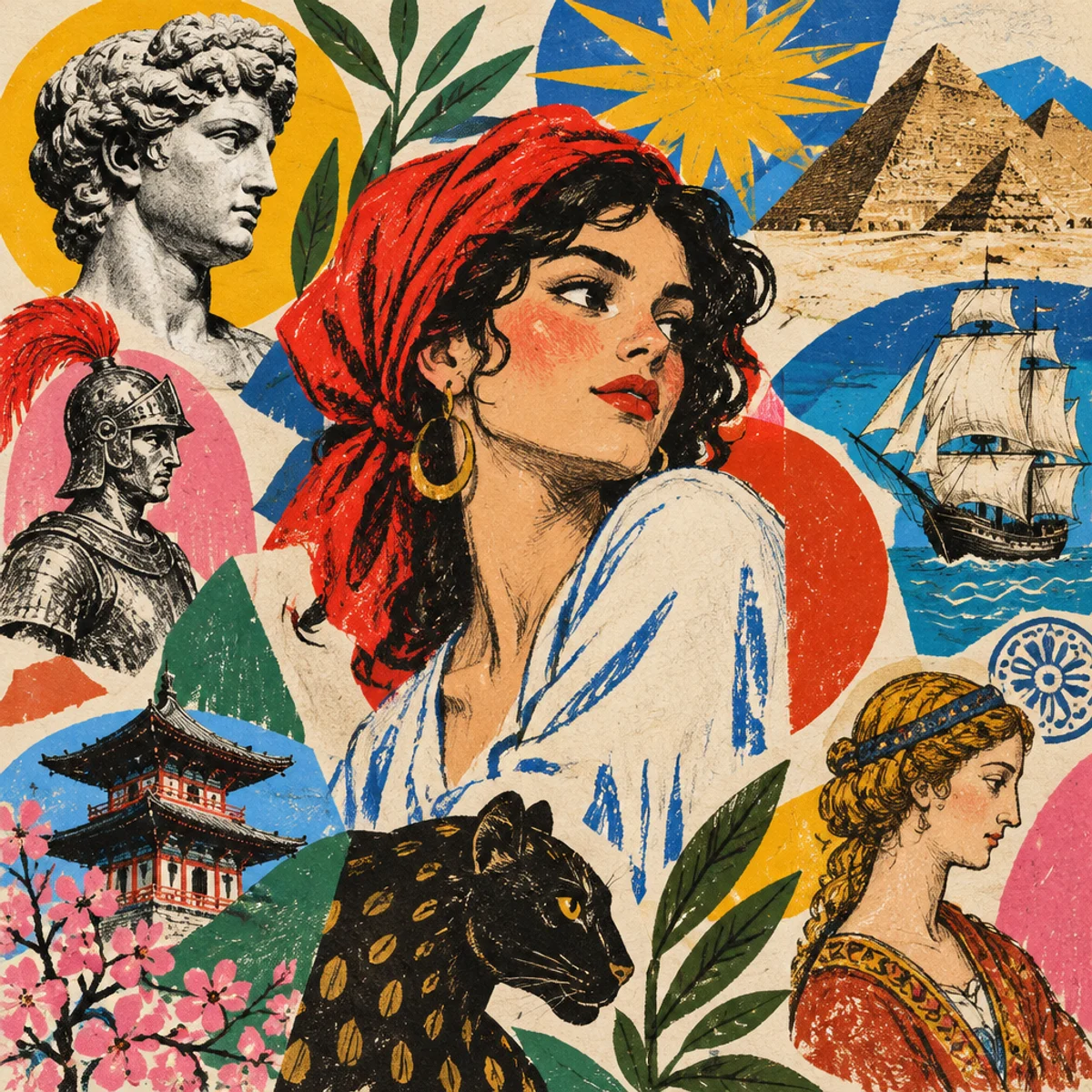
Posters
Eclectic illustration-led graphics with historical references, expressive figurative drawing, and bold poster shapes.
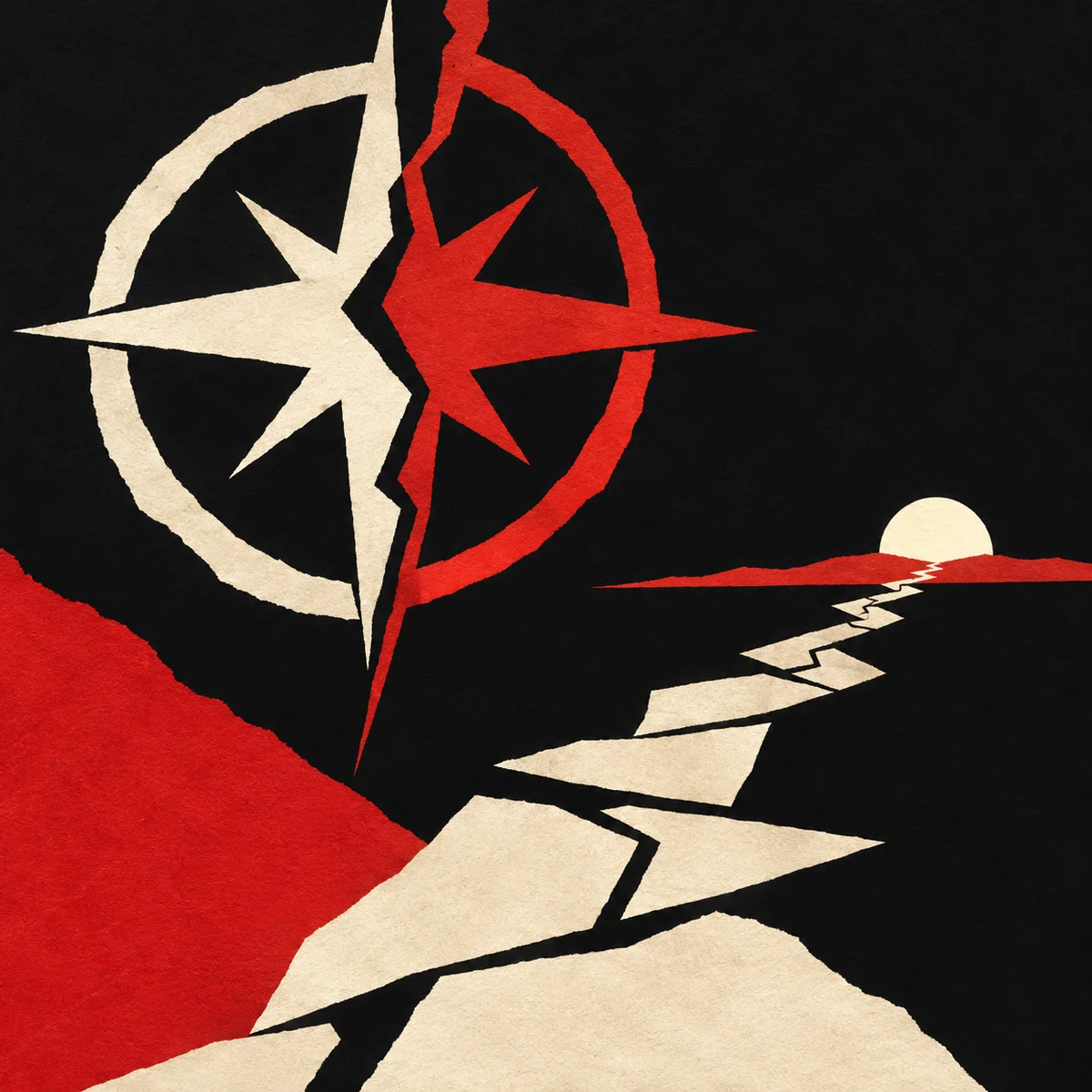
Posters
Cut-paper-like symbols and broad negative space reduce a mystery to one graphic image.
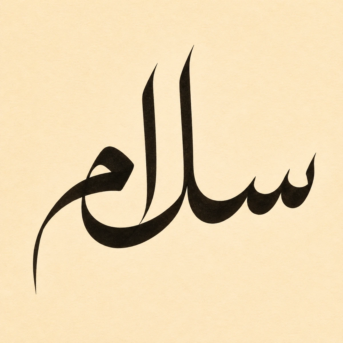
Persian lettering
Tall pen strokes give Thuluth its height. Look at salām, the Persian greeting for “hello.” Two uprights rise from a low row of teeth, while the last letter curves back beneath the word.
Persian lettering
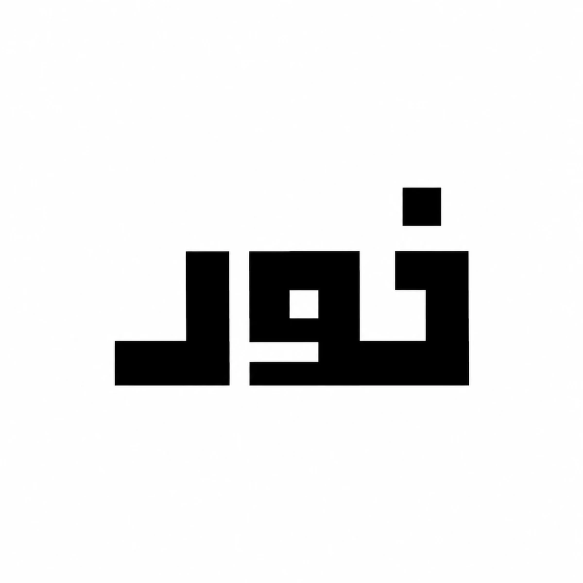
In square Kufic, the blank channels can be measured with the same unit as the ink. In nur, Persian for “light,” a single square dot sits above a run of right-angle turns.
Persian lettering
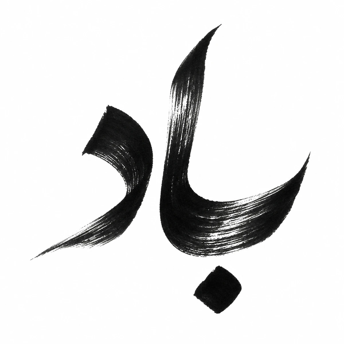
A loaded brush makes the upright in bād, Persian for “wind,” dense and black. As the bristles spread and lift, white streaks split the stroke into a ragged edge. The detached dot still reads as part of the first letter.
Persian lettering
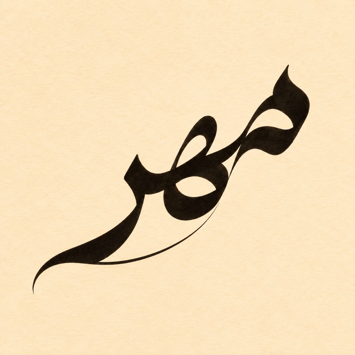
In this Diwani study, mehr, Persian for “affection,” climbs from a low sweep into a tight cluster of curves. The narrow loops and fine joins let the eye follow one letter into the next.
Persian lettering
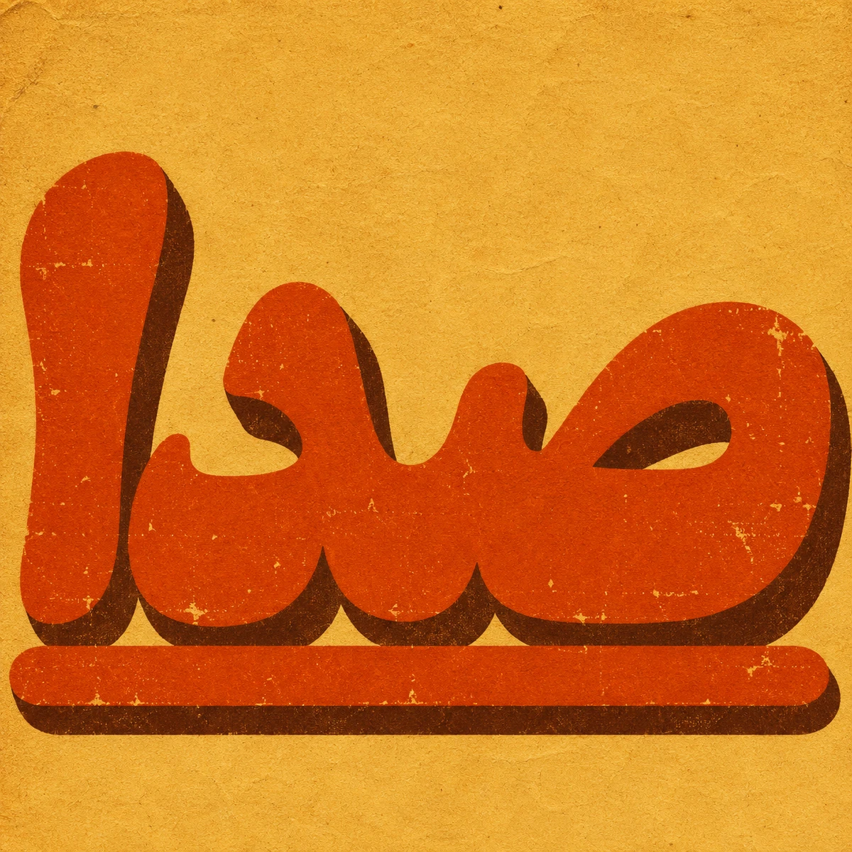
Sedā means “sound” in Persian. This imaginary film title pairs bulbous orange lettering with a brown shadow set just off the baseline. Flecks of ochre paper show through the ink like wear on a printed poster.
Persian lettering
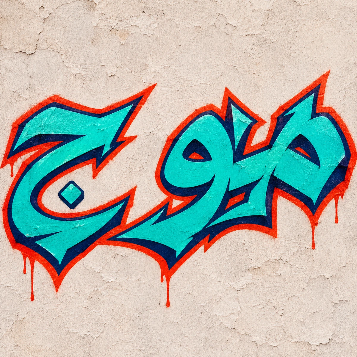
Mowj, Persian for “wave,” runs right to left across a plaster wall. Arrow tips pull the turquoise letters in opposing directions. Dark and vermilion outlines keep their edges visible where the strokes cross.
Persian lettering
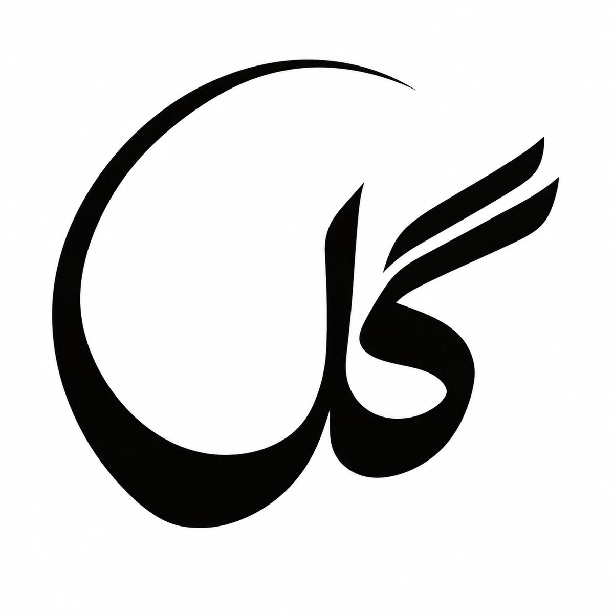
In gol, Persian for “flower,” the final letter sweeps up around the word to draw an open circle. The two sloping strokes of gaf give the eye a place to start reading inside the curve.
A Swiss grid organizes alignment and hierarchy. New Wave typography disrupts the grid with expressive spacing and placement. Constructivist graphics use diagonals, geometric form and forceful scale relationships.
Check generated lettering. A visual reference is not a production-ready print file or brand system.