
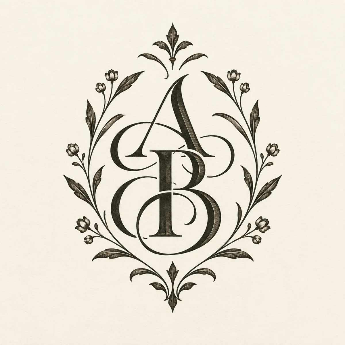
Ornamental calligraphy
Botanical monogram
Ornamental calligraphy adapted into a luxury monogram layout for foil-stamped packaging, emphasizing nested counters, crest-like symmetry, and refined botanical framing on ivory stock.
Make
Ornamental calligraphy with contrasting thick and hairline strokes, elegant connected forms, and balanced botanical flourishes on ivory paper.
This keeps the parent’s pointed-pen contrast, connected forms, and botanical ornament, but shifts from a horizontal word sample to a tight seal-like monogram for packaging. The visible change is structural: stacked initials, denser counterspace, and emblematic symmetry rather than a simple calligraphic line.
A starting point: add your own subject or details in your image tool.
Another original example of the same style seed.
Automated review only; results vary by image tool.
About this aesthetic and its examples
Compare more directions
Explore other approaches for this kind of project.

Look closer: traits and nearby styles →
About this example
This image may have used extra directions. The seed above is a reusable starting point and may produce a different result.
- Created with
- OpenAI Image API
- Model
- gpt-image-2.5-flare
- Generated
- 2026-10-17
How to use this promptRead as Markdown
Flourishes that support the letters
Thick strokes, fine hairlines and connected forms make the lettering rhythm visible. Botanical flourishes work around the word or initials, with open counters and enough space to preserve legibility.
Compare the word Bloom with the A & B monogram. The monogram concentrates the composition around interlocking initials; it does not establish a specific historical script or a physically foil-stamped object. Check intended letters before using generated lettering.
The Roundhand-inspired minimum study removes the botanical frame and concentrates on repeated arches, fine joins and shaded strokes. Read each letter separately, then compare the consistency of its slant and spacing across the whole word. The simpler composition helps reveal irregularities that ornament can conceal.
The ARETE historical specimen offers a documented reference for English Round Hand. Compare it with this original AI interpretation to distinguish historical letter construction from a generated impression. This word study is not a specialist-approved copybook.
Learn more: ARETE: English Round Hand from The Universal Penman
Look closer at Ornamental calligraphy
Contrasting thick and hairline strokes, elegant connected forms, and balanced botanical flourishes on ivory paper define this ornamental calligraphic lettering.
In the original generated example: The word Bloom, rendered as ornamental calligraphic lettering. Notice which details catch your eye before deciding whether the whole style is for you.
Explore across projects: Letters with personality · More is wonderful
Ask yourself: is it the palette, the surface, the shapes, or the subject you like? Save a favorite and use the visual taste guide to find a useful next direction.